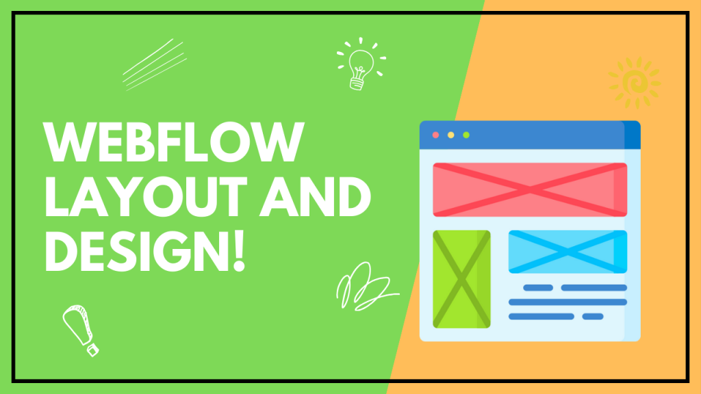
Webflow Layout and Design! Webflow offers a visual canvas for crafting responsive designs using a drag-and-drop interface. The platform streamlines web design by eliminating the need for coding.
Embracing the full potential of Webflow’s layout and design capabilities requires a grasp of its powerful tools and features. Users can leverage Webflow to create visually compelling and technically robust websites without the intricacies of traditional coding. This intuitive platform combines the functionalities of design software with the detailed control of hand-coded HTML, CSS, and JavaScript.
The responsive grid and flexbox systems make designing for various device sizes straightforward, while the pre-built elements and symbols save time on repetitive tasks. Building custom interactions and animations is also simplified through Webflow’s animation tools, enhancing the user experience. Tailored for both beginners and experienced designers, Webflow democratizes web development, empowering creativity and enabling the production of professional-grade websites.
Essential Components For Visual Hierarchy
Creating a compelling and user-friendly website design involves understanding the visual hierarchy. It’s the arrangement of elements in a way that implies importance, steering your audience’s attention to where you want it most. Mastering this technique requires a blend of aesthetics and functionality. Webflow offers sophisticated tools to achieve such visual finesse, and here, we’re zoning in on three essential components that are the building blocks to a structured, responsive, and visually appealing design.
Understanding Box Model And Display Settings
The box model is a cornerstone concept in CSS and Webflow alike. It’s the framework that details how elements are structured and interact with each other. Each element has a box that encompasses margins, borders, padding, and the actual content. By tweaking these properties in Webflow, designers can significantly influence the layout and hierarchy of a page.
- Margin controls the space between element borders and adjacent items.
- Border envelops the padding and content to provide a distinct edge.
- Padding creates space between the content and its border.
- Content is the core of the box where text and images live.
Moreover, display settings in Webflow dictate how elements behave. For instance, a block-level element occupies the entire width available, while an inline-block aligns elements in a row, maintaining their block properties. Knowing how to manipulate these settings enables the creation of layered, organically flowing designs.
Grids And Flexbox For Responsive Designs
Responsive design is non-negotiable in today’s multi-device world. With Webflow’s grid and flexbox features, designers can create layouts that adapt gracefully to various screen sizes.
- Grids: They are ideal for complex layouts requiring precise two-dimensional alignment of elements. Designers can define columns, rows, and areas within the grid, placing content in a manner that scales nicely across devices.
- Flexbox: This one-dimensional layout model provides the flexibility to align items either horizontally or vertically. It’s a surefire way to ensure elements distribute space dynamically and responsively.
Employing these tools reduces the need for media queries and hacky CSS, ensuring users get a seamless experience no matter their device.
Aligning Elements With Precision Using Position Controls
To achieve that pixel-perfect layout, elements must be aligned with precision. Webflow’s position controls grant that meticulous control to designers. There are different methods like static, relative, absolute, fixed, and sticky positioning. Webflow simplifies the process of implementing these settings visually, so fine-tuning element alignment becomes intuitive.
| Position Type | Description | Use-Case |
|---|---|---|
| Static | Default setting, elements flow as they appear in the HTML. | To maintain a natural document flow. |
| Relative | Element is positioned relative to its normal position. | For minor shifts from the normal document flow. |
| Absolute | Element is positioned relative to its nearest positioned ancestor. | For overlaying elements or precise placement regardless of the document flow. |
| Fixed | Element is positioned relative to the viewport. | For navigation bars or buttons that remain in view during scrolling. |
| Sticky | Element toggles between relative and fixed, based on the scroll position. | For headers that become fixed after a certain scroll point. |
Position controls are essential for layering elements, creating dynamic interfaces, and orchestrating movements that guide user interactions, cementing visual hierarchy as a dynamic, interactive experience rather than a static one.
Credit: www.webflow.com
Aesthetic Color Schemes For Stunning Sites
Injecting the right aesthetic color scheme into your Webflow project can transform your website from mundane to magnetic. An impactful color palette captivates visitors and bolsters brand identity, thus playing a crucial role in user engagement. It isn’t just about picking your favorite shades; it requires thoughtful consideration and strategic implementation. With Webflow’s design features, you can seamlessly integrate color theory and interactive design elements to construct visually compelling sites. Let’s dive into how to harness the power of colors to create a cohesive and accessible online experience.
Applying Color Theory For Brand Coherence
The use of color theory goes beyond mere aesthetics; it’s pivotal for brand recognition. By choosing a palette that reflects your brand’s personality and ethos, you can evoke specific emotions and actions from your audience. Use a primary color that represents your brand, along with secondary colors that complement and support your core hue. Site elements like buttons, links, and call-to-action features should be consistent with your brand color scheme, ensuring a harmonious and recognizable look across all pages.
Balancing Color Contrast For Readability And Focus
Contrast is key when it comes to readability and drawing user attention. A well-balanced contrast guides visitors through your content, making it easy to read and interact with. Aim for high contrast between your text and its background, prioritizing clarity over creativity. This is particularly important for users with visual impairments. Additionally, use contrasting colors to highlight the most important actions on the page, such as donation buttons or sign-up forms, helping them stand out and focus user action where it counts.
Interactive Elements: Hover States And Transitions
Enhance user engagement with interactive elements like hover states and smooth transitions. Interactive colors add a layer of sophistication and polish to your site. On hover, a button or link might change color, signaling to users that the element is interactive. Use Webflow’s capabilities to customize these hover states for a truly unique experience. Ensure that the transition between colors is smooth, not abrupt, to maintain a professional and sleek presentation. Together, these dynamics not only capture attention but encourage exploration and interaction with your site’s content.
Harnessing Web Fonts For Seamless Readability
The power of web typography should never be underestimated, especially when it comes to creating readable and accessible web content. Webflow’s design capabilities provide an outstanding platform to meticulously tailor every aspect of your website’s typography. Selecting the optimal web fonts not only enhances the visual appeal of your site but also significantly impacts user experience through seamless readability. By focusing on choosing the right font families and weights, implementing responsive text sizes and line heights, and maintaining consistency with global text styles, you can ensure that your text is as clear and legible as possible.
Picking The Right Font Families And Weights
Choosing the perfect font family is not just about aesthetics; it’s about function. A well-selected font can convey the tone of your content and ensure legibility across different devices and screen sizes. Consider readability, character set, and mood when selecting your font family. Broadly, sans-serif fonts offer a modern look, whereas serif fonts evoke a traditional feel.
In terms of font weight, it’s imperative to find a balance. Too light, and the text can be difficult to read; too bold, and the text can overwhelm the page. It’s best to use a normal or medium weight for body text and reserve heavier weights for headings or emphasis. Remember that additional weights increase page load times, so only include those you’re sure to use.
Implementing Responsive Text Sizes And Line Heights
Responsive design extends to typography. As screen sizes change, so should your text sizes and line heights to maintain readability. With Webflow, you can set text scale based on viewport widths, ensuring your content looks good on any device. It’s a best practice to use relative units like ems or rems for text sizes and line heights to create a proportional and harmonious layout.
Consider using the following parameters as a starting point:
- Body text – 16px base size with a line height of 1.5 times the font size.
- Sub-headings – Larger than body text by a factor of 1.25 to 1.5 with moderate line heights.
- Headings – Significantly larger than body text, with tighter line heights for impact.
Keep an eye on actual appearance in various devices to fine-tune sizes and heights for better legibility and aesthetics.
Consistency With Global Text Styles For Easy Updates
The power of global styles streamlines the design process in Webflow and allows for quick global changes to your site’s typography. Defining your text styles globally ensures consistency, making it simple to maintain the look and feel of your content open
- Defined styles for all headings (H1 to H6), paragraphs, and specialized text like blockquotes.
- Consistent use of font families, sizes, and weights across the site.
- Clear distinction between interactive elements such as links and buttons versus static text.
When you need to update your typography, changes are made once and propagate throughout the entire website, ensuring uniformity and saving you time.
Immersive Imagery In Web Layout And Design
Immersive imagery transcends the traditional boundaries of web design, offering a visually captivating experience that actively engages users and enhances storytelling. By thoughtfully integrating high-quality images, background videos, and dynamic effects like parallax scrolling within Webflow’s robust design platform, designers can craft unique, memorable websites that not only capture attention but also load efficiently and adapt to interactive user behaviors. Below, we’ll delve into techniques that elevate the power of imagery, providing a seamless, sensory-rich journey through your Webflow creation.
Selecting And Optimising Images For Faster Loading
Selecting the right images and optimising them for web performance is crucial. High-resolution photos deliver quality, but without proper optimisation, they can slow down your website. To maintain a balance between aesthetics and speed:
- Choose images that are visually appealing and relevant to your content.
- Use tools like Photoshop or online image compressors to reduce file size without compromising quality.
- Consider different file formats – JPEG for photographs, PNG for graphics with transparent backgrounds, and WEBP for high quality with smaller file sizes.
- Implement
- Utilize CSS techniques, such as the
background-sizeproperty, to ensure full responsiveness of background images.
Layering And Depth With Background Videos, Overlays
Background videos and overlays create a sense of depth, bringing a layered, multidimensional appeal to Webflow websites. Here’s how to harness these elements:
- Integrate short, looping videos as backgrounds to tell a story or convey a mood.
- Use
tags for embedding videos and ensure they are silently played, looped, and muted. - Overlay videos with semi-transparent color layers or gradients to achieve tone consistency and enhance readability.
- Optimise video backgrounds for web: compress file size, choose the right format, and consider an image fallback for mobile devices.
- Employ CSS properties like
z-indexandopacityto create a sense of depth between elements.
Parallax Scrolling For Dynamic Visual Effects
Parallax scrolling is a popular technique in web design that brings a dynamic and interactive feel to Webflow sites. This effect occurs when the website’s background images move slower than the foreground content while scrolling, creating an illusion of depth.
Implementing parallax in Webflow involves:
- Using the Webflow Designer interface to layer images and set different scrolling speeds.
- Assigning unique
data-speedattributes to create varying scroll speeds for different elements. - Applying CSS keyframe animations and transformations for smoother scrolling experiences.
- Ensuring the effect is subtle to prevent distraction or disorientation of the user.
Incorporating Interaction And Animations
In the ever-evolving digital landscape, Webflow brings to the forefront the power to create stunning and highly interactive websites without diving deep into coding. As you integrate interaction and animations into your Webflow projects, you not only enhance user engagement but also craft a memorable digital experience. By utilizing Webflow’s intuitive visual interface, designers can breathe life into their designs, stimulating user action and emphasizing critical content.
Trigger-based Interactions For User Engagement
User engagement soars when websites respond to user actions. By incorporating trigger-based interactions within Webflow, visitors are immersed in an interactive experience that rewards their participation. These triggers can be anything from mouse clicks to scroll depth, and are easily customizable within the platform.
- Hover animations that reveal additional content or change color for interactive buttons.
- Scroll into view triggers that activate animations as the user scrolls through content.
- Page load triggers that initiate animations when a website first loads, creating an immediate impact.
Subtle Motions To Guide User Flow And Highlight Content
Animating your layouts with subtle motions can effectively guide users through the website’s narrative. These small, purposeful animations direct attention and provide a seamless transition between sections of content. Webflow’s suite of design tools helps in creating fluid motions that:
- Direct attention to key features or calls to action.
- Reduce cognitive load by progressively disclosing information.
- Promote content hierarchy and readability through organized layout transitions.
Custom Lottie Animations For A Unique Brand Experience
Lottie animations are a game-changer for brands looking to establish a unique identity. These animations are scalable, high-quality, and can be easily embedded into Webflow projects. By customizing and implementing Lottie animations, brands can:
| Advantage | Outcome |
|---|---|
| Create memorable interactions | Ensure users recall your brand with distinct animated elements. |
| Display complex ideas simply | Convey intricate concepts through engaging, understandable visuals. |
| Stay ahead of the curve | Stand out in competitive markets with cutting-edge design trends. |
Webflow’s integration with Lottie empowers designers to apply interactive animations that entail vector-quality without the typical file size overhead. Customizing these animations with Webflow’s GUI allows for adaptation to different brand styles and interaction requirements.
Frequently Asked Questions Of Webflow Layout And Design
How To Create A Responsive Design In Webflow?
Webflow simplifies responsive design with breakpoints and flexbox. Start by designing for a base size, then adjust layouts and styles for different devices. Use Webflow’s built-in breakpoints or create custom ones to ensure your design looks great on any screen.
Can You Animate Elements In Webflow?
Yes, Webflow offers robust animation tools. Without coding, you can trigger animations on scroll, click, or hover. Webflow’s Interactions panel lets you create detailed animations and transitions for a dynamic user experience.
What Is The Best Way To Use Webflow’s Grid System?
Utilize Webflow’s grid system to create complex layouts with ease. Start by adding a grid element, then insert and position your content in the cells. Adjust column and row dimensions and gaps for a clean, organized design.
Does Webflow Support Custom Fonts?
Webflow does support custom fonts. Upload your own fonts or select from Google Fonts and Adobe Fonts integrated in the platform. Ensure text is readable across all devices by adjusting font size and line-height for different breakpoints.
Conclusion
Embracing Webflow’s layout and design capabilities elevates your web presence. It blends ease-of-use with robust features for stunning results. Dive into this platform, harness its potential, and watch your digital creations thrive. Let’s transform your online space with Webflow’s dynamic toolkit today.
Pingback: Client First Finsweet : Enhancing Customer Experience